This week in Comm 130 I learned about making Icons! We were given the challenge to make four to six icons that all tie in to the same theme. I chose to make icons for different types of weather.
My target audience for the icons are people who may want to take a quick glance on their phones, tablets, or computers to see what the weather is like. I needed to create icons that will communicate the correct message by looking at it for just a second or two. I focused on simplicity, shape, and color to communicate each message.
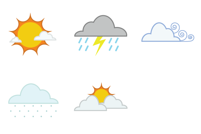
It was fun and challenging to make each icon communicate a unique message while still maintaining a uniform theme. I was able to apply my newly acquired skills in Adobe Illustrator for this assignment. Below are my five weather Icons:
Sunny

Snowy

Cloudy

Stormy

Windy

Design Decisions
I focused my design on using color, shape, and repetition to maintain a theme while making each icon communicate something different. I changed a lot of things in my icons throughout the process. After making several different shapes of clouds, I decided to use just one shape to keep uniformity. I also added the small clouds to the Sunny icon, because it was the only icon without clouds included. The Windy icon was the most challenging, as I had a hard time communicating wind. I started with trees blowing and swirl lines, but the trees didn’t tie in well with the theme. I added a cloud, but then it looked too busy. The finished icon has new swirls, the cloud, and no trees. I think its current version fits best with the rest of the icons. I also tweaked the colors of the Stormy icons several times to find the right balance on uniqueness and uniformity.

Conclusion
This project was really fun! I enjoyed making the icons, and learning how to use Adobe Illustrator. Feel free to comment and let me know what you think!


